Introduction: Why Bedroom Color Matters for Mental Health
When it comes to creating a restful and welcoming bedroom, color is more than just a decorative choice—it’s a powerful tool that can significantly influence your mood, sleep quality, and overall sense of well-being. In American homes, where the bedroom serves as a personal sanctuary from everyday stress, selecting the right color palette is especially important. Color psychology shows that certain hues can calm the mind, encourage relaxation, and even help you fall asleep faster. Whether you’re looking to unwind after a long day or wake up feeling refreshed, understanding how color affects your mental health can help you design a space that truly supports emotional balance and peace of mind.
2. The Science Behind Color and Mood
Color psychology is more than just a trending topic in interior design; it’s a well-researched field that reveals how specific colors can impact our emotional health, especially within the bedroom environment. In the United States, where fast-paced lifestyles and high stress are common, creating a restful retreat through color choice is gaining increased attention among homeowners and designers alike.
How Colors Influence Sleep and Stress
Recent studies from American universities and sleep foundations highlight that certain hues can either promote relaxation or contribute to restlessness. For example, cool tones like blue and green are associated with lower heart rates and reduced anxiety, making them ideal for bedrooms. On the flip side, intense colors such as red or bright orange can stimulate the mind, potentially interfering with your ability to unwind at night.
Color Impact on Mood: An American Perspective
| Color | Effect on Mood | Influence on Sleep | Common Usage in US Bedrooms |
|---|---|---|---|
| Blue | Calming, reduces anxiety | Promotes deeper sleep | Highly popular for master suites |
| Green | Refreshing, balances emotions | Encourages relaxation before bed | Frequently used in guest rooms & nurseries |
| Gray | Soothing but can feel cold if overused | Neutral backdrop for restful sleep | Modern American bedrooms favor light grays |
| Pale Yellow | Lifts mood, adds warmth without overstimulation | Keeps atmosphere cheerful yet tranquil | Sought after for children’s rooms or east-facing bedrooms |
| Purple (Soft/Lavender) | Promotes creativity and serenity | Mildly calming if not too dark or vibrant | Increasingly trendy in contemporary designs |
| Red/Orange (Bold Shades) | Energizing, may increase alertness/stress levels | Tends to disrupt restful sleep cycles | Sparingly used—mainly as accent pieces or décor highlights |
The Bottom Line: Choosing Wisely for Well-being
The consensus among American researchers and design experts is clear: subtle, muted tones foster better sleep hygiene and reduce stress. By understanding the science behind color selection, you can make informed decisions that transform your bedroom into a true sanctuary—tailored to support both psychological well-being and lifestyle needs.
![]()
3. Top Color Picks: Best Shades for Bedroom Serenity
When it comes to designing a bedroom that nurtures psychological well-being, color selection is key. Across American homes, certain hues have gained popularity for their ability to create restful and inviting spaces that support healthy sleep patterns. Here’s a closer look at the best colors recommended by experts for promoting relaxation and serenity in the bedroom.
Calming Blues: America’s Favorite for Tranquility
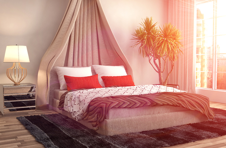
Shades of blue—ranging from powder blue to deep navy—are widely considered the top choice for bedrooms in the United States. Psychologically, blue is associated with calmness, trust, and stability. Many American homeowners choose light blue walls paired with crisp white linens to evoke the breezy feel of coastal retreats or peaceful lakeside cabins. This combination helps reduce stress levels and supports a soothing environment ideal for winding down after busy days.
Serene Greens: Bringing Nature Indoors
Soft greens, like sage or mint, have become increasingly popular among Americans who want to channel the restorative qualities of nature into their personal spaces. Green symbolizes growth, renewal, and balance—making it perfect for bedrooms focused on wellness. A gentle green accent wall or bedding set can mimic the calming effect of a walk through a quiet forest, helping ease anxiety and improve overall restfulness.
Cozy Neutrals: Creating Warmth and Comfort
Neutral palettes—think creamy whites, warm taupes, and gentle greiges—are a staple in modern American bedroom design. These shades offer versatility while delivering a sense of coziness and understated elegance. By layering different neutrals with textured throws or plush rugs, homeowners can cultivate a welcoming atmosphere that encourages deep relaxation and uninterrupted sleep.
American Lifestyle Example:
Whether you’re decorating a New York City apartment or a suburban Texas home, integrating these color choices aligns with popular American trends that prioritize both comfort and style. Many families opt for blue or green master bedrooms while keeping guest rooms neutral, ensuring every space feels like a restful retreat tailored to its occupants’ needs.
4. Colors to Avoid: What Could Disrupt Your Sleep
While selecting soothing colors is key for a restful bedroom, its equally important to know which hues might actually work against your psychological well-being and sleep quality. In U.S. interior design, certain bold or stimulating colors have trended in accent spaces like kitchens or home offices—but they’re usually avoided in bedrooms for good reason. Here’s what you should watch out for:
Bold & Stimulating Hues
Colors that are overly bright or intense can overstimulate the mind, making it difficult to wind down at night. According to leading American design publications and sleep experts, the following colors tend to be less suitable for bedrooms:
| Color | Psychological Impact | Why It’s Not Ideal for Bedrooms |
|---|---|---|
| Red | Energizing, increases heart rate | Can cause restlessness and heightened alertness—counterproductive when trying to sleep |
| Bright Orange | Stimulating, invigorating | May make it hard to relax or de-stress after a long day |
| Vivid Yellow | Mood-lifting but highly energizing | Tends to keep the brain active instead of signaling it’s time for rest |
| Neon Shades | Overwhelming, visually noisy | Create an anxious atmosphere; not recommended by most U.S. designers for restful spaces |
Current U.S. Design Trends: Less is More in Bedrooms
American design trends emphasize calm and relaxation in bedroom spaces. While bold hues are popular as statement walls or décor in living rooms and kitchens, most U.S.-based interior designers recommend opting for muted, neutral, or pastel tones in bedrooms. This aligns with growing wellness-focused design philosophies that prioritize mental health and restorative sleep.
Pro Tip:
If you love vibrant colors, consider using them as subtle accents—think throw pillows or small decorative pieces—instead of painting entire walls. This way, you can enjoy your favorite shades without compromising your sleep environment.
5. Personalizing Your Palette: Tips for Every Style
When it comes to creating a bedroom that supports psychological well-being, blending color psychology with your preferred American design aesthetic is key. Here’s how you can personalize your palette for popular styles while maximizing both comfort and visual harmony:
Farmhouse Chic
If you love the cozy, nostalgic feel of farmhouse chic, opt for soft, muted colors inspired by nature. Sage green, pale blue, and creamy white foster tranquility and relaxation. Layer different textures—think linen bedding or distressed wood accents—to enhance warmth without overwhelming the senses.
Modern Minimalism
For fans of sleek modern minimalism, less is more. Stick to a restrained palette of calming neutrals like dove gray, taupe, or subtle blush. Incorporate accent pieces in deeper blues or greens to promote peace and mental clarity without cluttering the visual field.
Boho Retreat
Those drawn to bohemian style can integrate earthy tones such as terracotta, ochre, and olive green—colors linked to grounding and creativity. Use these hues sparingly on feature walls or textiles to maintain balance and prevent overstimulation.
Coastal Comfort
A coastal-inspired bedroom benefits from cool blues, sandy beiges, and crisp whites. These shades mimic the serenity of ocean landscapes and support restful sleep. Pair with natural materials like rattan or driftwood for an authentic American beach-house vibe.
Urban Industrial
If you prefer an industrial look, choose moody charcoals or deep navy balanced by lighter grays and metallics. These tones create a cocoon-like effect that feels secure yet sophisticated—perfect for unwinding after a busy day in the city.
Expert Tip
No matter your style, always test paint samples in your actual lighting before making a final decision. Small changes in hue can dramatically affect mood and perception. Remember: The best bedroom color palette is one that not only looks great but also feels right for you.
6. FAQs: Addressing Common Color Concerns
What are the most recommended bedroom paint colors for psychological well-being?
Soft blues, muted greens, gentle grays, and warm neutrals are widely recognized by psychologists and designers in the U.S. as top choices for promoting relaxation and restful sleep. These shades help reduce stress and foster a calm atmosphere, making them ideal for bedrooms.
Are there popular U.S.-based paint brands offering wellness-oriented color palettes?
Absolutely! Major American brands like Benjamin Moore, Sherwin-Williams, and Behr offer dedicated collections inspired by wellness trends. For example, Benjamin Moore’s “Color Trends” palette and Sherwin-Williams’ “Living Well” collection feature many calming hues specifically designed to support emotional health in living spaces.
How can I balance current color trends with long-term well-being?
If you love following trends but want to prioritize well-being, choose muted versions of trending colors or use trendy shades as accent walls or decor items. This way, your space feels fresh and current without sacrificing tranquility or comfort essential for bedrooms.
Is it okay to use bold colors in a bedroom?
Bolder colors—like rich navy or deep green—can work if used thoughtfully. Consider painting just one wall or using these shades through textiles and accessories, so the room still feels restful while reflecting your personal style.
How often should I repaint my bedroom for optimal well-being?
There’s no strict timeline, but many Americans update their bedroom colors every 5-7 years or when life circumstances change. If your current color feels outdated or negatively impacts your mood, it may be time for a refresh that better supports your mental health.
Can eco-friendly paints support both health and color goals?
Yes! Many U.S. brands now offer low-VOC and zero-VOC paints in a wide range of soothing colors. Choosing these products helps maintain indoor air quality while still allowing you to create a psychologically supportive bedroom environment.