1. The Psychology Behind Color Choices
Color isn’t just a visual experience; it’s a powerful psychological tool that shapes how we think, feel, and act—especially within the context of American culture. When it comes to balancing bold and subtle tones, understanding the psychology behind color choices is crucial for anyone looking to influence perception or drive engagement. In the United States, vibrant reds and energetic yellows are often linked to excitement, confidence, and action—think of fast-food branding or sports team colors. On the flip side, muted blues and soft grays evoke feelings of trustworthiness, calm, and professionalism, making them favorites for tech companies and financial institutions. The way you mix these tones in your designs or communications can make or break your message. Mastering tone selection is not just an art—it’s a strategic investment in how your audience perceives your brand or product. By tapping into these psychological cues, you can direct attention where you want it, inspire desired emotions, and ultimately drive behavior that aligns with your goals. That’s why savvy designers and communicators treat color mixing as both a creative exercise and a high-return asset in their toolkit.
2. Defining Bold and Subtle Tones
Understanding the difference between bold and subtle tones is foundational for effective color mixing, especially in U.S. markets where consumer psychology heavily influences branding and digital advertising outcomes. Let’s break down these two color categories and see how they play out in real-world American scenarios.
What Are Bold Tones?
Bold tones are colors that immediately grab attention. They are often saturated, vivid, and high-contrast, making them ideal for creating a sense of urgency, excitement, or energy. In the U.S., brands like Target use vibrant reds to evoke passion and stimulate impulse buying. Digital ads for sports drinks or tech gadgets frequently employ electric blues or neon greens to ensure their message pops on a crowded feed.
Key Characteristics of Bold Tones:
- High saturation
- Strong contrast against backgrounds
- Associated with energy, action, and confidence
- Frequently used for calls-to-action (CTAs) in retail and digital advertising
What Are Subtle Tones?
Subtle tones, on the other hand, are more muted, soft, and understated. These colors create a calming effect and convey sophistication or trustworthiness—critical traits for brands seeking long-term customer loyalty in America. Think of Apple’s use of sleek grays or the pastel palettes favored by wellness brands targeting millennial audiences.
Key Characteristics of Subtle Tones:
- Low saturation
- Smooth blending with other elements
- Evoke calmness, reliability, or elegance
- Commonly used for background elements or premium product lines
Real-World Examples in the U.S.
| Industry/Brand Example | BOLD Tone Usage | SUBTLE Tone Usage |
|---|---|---|
| Retail (Target) | Bright red in logos & sales tags | Light gray shelving & signage backgrounds |
| Tech (Apple) | Saturated blue for new feature highlights | Minimalist whites & silvers for product display |
| Wellness (Calm App) | Aqua accents in promotional banners | Pale blues & lavenders throughout app UI |
| E-commerce (Amazon) | Orange “Buy Now” buttons | Creamy backgrounds for product listings |
Why This Matters for Your Brand ROI:
The strategic mix of bold and subtle tones can significantly impact user engagement and conversion rates in the competitive American market. By clearly defining what makes a tone bold or subtle—and knowing when to deploy each—you set your brand up for higher recognition and better returns from every marketing dollar spent.
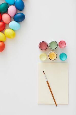
![]()
3. Striking the Perfect Balance
Learning from America’s Most Successful Brands
Top American brands have mastered the art of blending bold and subtle tones to create unforgettable visual experiences. Think about Apple’s minimalistic yet impactful use of white contrasted with sleek metallic accents, or Coca-Cola’s iconic red set against clean whites and subtle grays. These brands understand that color isn’t just decoration—it’s a strategic tool for engagement and brand recall.
Strategic Layering for Visual Harmony
The key is intentional layering. Bold colors grab attention and evoke energy, while subtle tones add depth and sophistication. For example, Nike often uses a powerful black or vibrant orange as a focal point but balances it out with soft neutrals or muted backgrounds, ensuring the message is energetic without being overwhelming. This technique guides the viewer’s eye while maintaining overall harmony.
Maximizing Engagement Through Contrast
Smart brands leverage contrast not just for aesthetics but also for psychological impact. By pairing a bold call-to-action color (like blue or green) with understated shades, companies can direct user behavior on websites or in-store displays. This approach increases click-through rates and purchase intent by making important elements pop—delivering measurable ROI on design decisions.
Takeaway: Harmonize for Results
Ultimately, striking the perfect balance between bold and subtle tones isn’t about following trends—it’s about understanding your audience and guiding their experience. American market leaders show that when you blend colors thoughtfully, you build trust, drive action, and boost your brand’s bottom line.
4. Practical Mixing Techniques
Step-by-Step Guide for Balancing Bold and Subtle Tones
Mastering the art of color mixing, whether digitally or with physical media, is all about understanding how bold and subtle tones interact. Here’s a practical, hands-on approach designed for American creators who want results that pop—without overwhelming the senses.
Using Digital Tools: Photoshop & Procreate
- Start with a Neutral Base: Open your canvas and lay down a neutral gray or beige background to ground your palette.
- Select Your Bold Color: Choose a vibrant hue (think electric blue or fire-engine red). Place this color in key focal areas using a hard brush at 80-100% opacity.
- Add Subtle Tones: Sample your bold color, then reduce its saturation by 60-70% in the color picker. Paint around your bold areas with these muted variations using a soft brush at 30-50% opacity.
- Create Contrast & Harmony: Use adjustment layers (like Hue/Saturation or Curves) to tweak intensity until you hit that sweet spot between vivid and understated.
- Check for Balance: Zoom out and squint—if one area dominates, adjust by layering more subtle tones or muting the bold spots slightly.
Physical Media: Acrylics, Watercolor, & Markers
- Prepare Your Palette: Squeeze out your main bold color alongside primary neutrals (white, black, ochre).
- Mix Subtle Variations: Gradually blend small amounts of white, gray, or complementary colors into your bold pigment to create nuanced shades.
- Test Swatches: On scrap paper, test both pure bold tones and their subtle mixes. Let them dry fully to see true results.
- Layer with Purpose: Apply bold colors as accents—think borders or highlights—while filling larger spaces with the subtler mixes. Blend edges lightly to avoid harsh transitions.
- Evaluate Under Different Light: Natural daylight versus indoor lighting can shift perception. Always check your work in both before calling it done.
Quick Reference Table: Digital vs. Physical Mixing Tips
| Technique | Digital Tools | Physical Media |
|---|---|---|
| Bases | Neutral layer on canvas | Acrylic gesso or light wash |
| Bolding Up | Saturated hues at high opacity | Pigment straight from tube/marker |
| Toning Down | Saturation slider / Opacity adjustments | Add white/gray or complementary color |
| Balance Check | Zoom out/squint method; layer adjustments | Distant view; compare wet vs. dry swatch |
| Cultural Fit | Tweak palettes for U.S. moods (e.g., patriotic reds/blues for July 4th) | Select regionally relevant colors (earthy tones for Southwest themes) |
If you want color combinations that deliver real impact—whether it’s for branding, home décor, or digital artwork—these practical steps will help you strike the perfect balance between assertiveness and subtlety every time.
5. Color Mixing for Different Contexts
When it comes to balancing bold and subtle tones, context is everything. The ideal mix of colors isn’t universal—it shifts dramatically depending on where and how you’re applying it. Let’s break down how this works across key American settings: business, home decor, and online content.
Business Environments
In the U.S., corporate spaces often favor a conservative approach with subtle tones like navy, gray, or beige forming the base palette. These colors project professionalism and reliability. However, forward-thinking companies are increasingly incorporating bold accent colors—think a splash of vibrant blue in a tech startup’s lounge or a pop of energizing orange in a creative agency’s meeting room. The trick is to use bold tones strategically as highlights to foster creativity without overwhelming the senses.
Home Decor
American homeowners tend to lean into subtle palettes for main living areas—soft whites, muted greens, and gentle blues—to create a calm, inviting atmosphere. But there’s also a trend toward using bold colors as statement pieces: a bright red front door for curb appeal, an accent wall in emerald green, or a canary yellow sofa that draws the eye. The psychological payoff? Subtle tones nurture relaxation, while pops of bold color add personality and visual interest.
Online Content
The digital world flips the script. Americans expect online content—whether it’s a website, ad campaign, or social media graphic—to grab attention quickly. Here, bold colors reign supreme for headlines, buttons, and calls-to-action. Yet, overdoing it can feel “salesy” or untrustworthy. Top-performing U.S. brands mix in subtle backgrounds and understated fonts to keep things readable and professional while letting their bold elements drive engagement.
Practical Takeaway
No matter the setting, the smartest approach is to tailor your color mixing strategy to your audience’s expectations and your own goals. Want trust? Lead with subtlety. Want impact? Add boldness—but don’t let it overpower your message or space.
6. Evaluating Results and Iterating
Once your design balances bold and subtle tones, the next step is evaluating its real-world impact—a crucial practice in U.S. design culture. Success isn’t just about aesthetics; it’s about measurable outcomes and continuous improvement.
Shareable Metrics for Design Impact
In the U.S., designers rely heavily on data-driven feedback to justify color choices. Popular metrics include:
User Engagement Rates
Track clicks, time spent on page, and interaction rates to see if your color palette draws attention and supports navigation.
Conversion Rates
If your goal is sales, sign-ups, or downloads, monitor how different color schemes influence these numbers. A/B testing is a standard method: present two versions with varying color mixes and see which performs better.
Brand Recall & Recognition
Use surveys and brand recognition tests to determine if your audience remembers your colors—and by extension, your message—after interacting with your design.
Feedback Methods Embraced in the U.S.
Gathering honest opinions is essential. American companies often use:
User Testing Sessions
Invite diverse users to interact with your design and discuss their feelings about the color choices. Record their feedback for actionable insights.
Online Surveys & Polls
Quick polls on platforms like SurveyMonkey or Google Forms allow you to reach a broad audience for fast feedback on color preferences and emotional response.
Social Listening
Monitor comments, shares, and reactions on social media to gauge how your audience feels about your new look in real-time.
The Iteration Mindset for Color Optimization
Don’t treat your first palette as final. Use the collected data to refine bold and subtle tones further. In the U.S., an iterative approach—testing, tweaking, and retesting—is a hallmark of high-performing teams. This cycle not only maximizes psychological resonance but also ensures you’re investing resources where they yield the best returns, whether that’s higher engagement, stronger brand identity, or increased sales. Ultimately, blending analytical review with creative intuition helps you achieve the perfect balance of colors that truly connect with your audience.