Understanding the Power of Color in Interior Design
Color isn’t just a decorative choice—it’s a transformative tool that shapes how we feel and interact within a space. In American homes, the color palette you choose for your living room can dramatically influence mood, perception of space, and overall ambiance. For instance, cool tones like soft blues and gentle greens are often associated with tranquility and relaxation, making them favorites for creating a calm retreat from daily life. On the other hand, warm hues such as sunny yellows or bold reds can infuse energy and warmth, encouraging conversation and a welcoming atmosphere.
Culturally, Americans tend to embrace palettes that reflect both individuality and comfort—think earthy neutrals mixed with pops of color or crisp whites paired with navy or charcoal accents. Psychologically, lighter shades help rooms feel more expansive, while deeper colors create intimacy and coziness. By understanding these subtle cues, you can set the stage for a living room makeover that not only looks stylish but also feels just right for your lifestyle.
2. Identifying Your Living Room’s Unique Features
Before diving into paint swatches and fabric samples, take a step back to assess what makes your living room unique. Pinpointing these features not only honors the character of your space but also sets the stage for a color palette that feels natural and intentional. Here are the essential elements you’ll want to consider:
Natural Light
Light can dramatically shift how colors appear throughout the day. South-facing windows invite warmth, making cool tones feel balanced, while rooms with limited sunlight benefit from brighter hues to energize the space. Observe your living room at different times to see how daylight interacts with your surfaces.
Room Size & Proportions
The scale of your living room should inform your color decisions. Lighter shades visually expand smaller spaces, creating an airy feel, whereas darker tones can make larger rooms feel cozy and grounded. Here’s a quick comparison:
| Room Size | Color Palette Suggestions |
|---|---|
| Small/Cozy | Soft neutrals, pastels, light grays |
| Large/Open | Deep blues, forest greens, bold accents |
Existing Materials & Furnishings
Your living room’s fixed features—think hardwood floors, brick fireplaces, or built-in shelves—should harmonize with your color palette. If you have oak trim or exposed beams, look for complementary undertones in your wall colors to tie everything together seamlessly.
Architectural Style & Character
The bones of your space play a big role in how colors will read. A Mid-Century Modern home may call for saturated retro hues, while a Craftsman bungalow might shine with earth-inspired palettes. Don’t fight the architecture—let it inspire your choices.
Pro Tip: Make a List!
Create a checklist of these unique features before heading to the paint store. This way, every color decision is rooted in what makes your living room special—not just what’s trending.

3. Trending Color Palettes in Modern American Homes
When it comes to designing a living room that feels both stylish and personal, understanding current color trends in American homes is key. Today’s most sought-after palettes reflect a blend of comfort, sophistication, and regional identity—making it possible to create a space that truly resonates with your lifestyle.
Timeless Neutrals: The Foundation of Modern Style
Neutrals remain the cornerstone of contemporary American interiors. Think warm beiges, soft grays, and creamy whites—they offer a versatile backdrop that complements any décor style. These shades evoke tranquility and light, making them especially popular in coastal and suburban homes where an airy, open vibe is desired.
Bold Accents: Making a Statement
While neutrals ground the space, bold accent colors are having a major moment. Deep navy blues, forest greens, and even spicy terracottas are being used to inject energy and personality into living rooms across the country. In urban settings like New York or Los Angeles, you’ll often see daring pops of color on a feature wall or in furniture pieces, creating an artistic focal point without overwhelming the senses.
Regional Influences: From Coast to Coast
Color preferences can also vary dramatically depending on where you live. On the West Coast, earthy tones inspired by natural landscapes—such as sage green or sandy taupe—are popular. In the Midwest, rich jewel tones like burgundy or emerald bring warmth to traditional spaces. Meanwhile, Southern homes tend to embrace cheerful hues—sunny yellows or coral pinks—that reflect hospitality and charm.
By exploring these trending palettes and considering your region’s unique influences, you’ll be equipped to select colors that not only look great but feel distinctly yours. The right combination of timeless neutrals and bold accents can transform your living room into a stylish sanctuary that stands out while staying true to its American roots.
4. Balancing Style and Functionality
When choosing the right color palette for your living room makeover, balancing style with functionality is essential for a space that feels both beautiful and livable. In American homes, the living room often serves as the heart of the household—a place where family movie nights, game-day gatherings, and quiet relaxation coexist. Your color choices should reflect not only your personal aesthetic but also accommodate the diverse ways you use your living room every day.
Curating a Palette for Real Life
Start by considering how you use your living room most. Do you love hosting friends for Sunday football? Is it a cozy retreat after work? For rooms that double as entertainment hubs, opt for colors that are inviting yet resilient to spills and wear—think warm neutrals, deep blues, or subtle earth tones. If relaxation is your priority, soft greens or calming grays can create a soothing atmosphere. Remember, a stylish palette should support rather than hinder your lifestyle.
Color Choices That Work for Every Occasion
| Palette Type | Best For | Suggested Colors | Why It Works |
|---|---|---|---|
| Entertaining-Ready | Hosting Guests & Parties | Navy Blue, Charcoal, Warm Beige | Masks stains; feels welcoming; easy to pair with bold accents |
| Family-Focused | Kids & Everyday Use | Sage Green, Taupe, Soft White | Low maintenance; light colors open up space; calming vibes |
| Relaxation Retreat | Reading & Unwinding | Pale Gray, Blush Pink, Dusty Blue | Smooths visual noise; creates a tranquil mood; enhances natural light |
Tips for Achieving Balance
- Layer with Texture: Incorporate textiles like throw pillows and rugs in complementary shades to add depth without overwhelming the palette.
- Accent Wisely: Use accent walls or décor pieces in bold hues to inject personality while keeping the overall look cohesive and functional.
- Consider Light: Natural daylight affects how colors appear throughout the day. Test paint swatches at different times to ensure your choices stay versatile and appealing.
- Practical Surfaces: Choose washable paints and durable fabrics to maintain style even during high-traffic moments or family activities.
A well-balanced color palette is about more than just looks—its about creating an adaptable environment that supports every facet of modern American living. By thoughtfully blending style and practicality, your living room will become a true centerpiece that welcomes both everyday comfort and special occasions alike.
5. Testing and Finalizing Your Palette
Before you commit to a new color palette for your living room makeover, it’s crucial to take the time to test and finalize your choices. This step can save you from costly mismatches and ensure the finished space feels as stylish as you envisioned. Here’s how to approach this process with confidence and creativity.
Tips for Sampling Colors
Don’t rely solely on what you see in-store or online—lighting at home makes a big difference. Purchase small sample pots of your chosen paints and apply generous swatches directly onto your living room walls. Observe them throughout the day under different lighting conditions, both natural and artificial, to see how they shift in tone and intensity.
Using Swatches Effectively
Paint isn’t the only element that needs testing. Gather fabric swatches for upholstery, throw pillows, or curtains, and lay them next to your painted wall samples. Include wood or metal finish samples if you’re updating furniture or hardware. Arrange all these elements together in one spot—a “mood board” right in your living room—to get a holistic sense of how your color palette comes together in real life.
Considering Finishes Before Deciding
Finishes matter just as much as color. Matte paint absorbs light and offers a softer look, while glossier finishes reflect light and add vibrancy. For a modern American vibe, consider mixing finishes—matte walls with glossy accents or metallic details—to add depth without overwhelming the space. If you’re drawn to a specific trend, like velvet sofas or brushed brass fixtures, bring those samples into the mix before making any final decisions.
Taking these extra steps ensures your living room makeover not only looks intentional but also feels cohesive and inviting—perfectly tailored to your personal style and the nuances of your home’s unique light.
6. Accessorizing to Enhance Your Color Scheme
Once you’ve established the perfect color palette for your living room, the magic truly happens when you start layering in accessories. Thoughtfully chosen textiles, artwork, and décor pieces not only amplify your chosen hues but also inject a sense of personality and warmth into the space. Here’s how to accessorize with intention while keeping your living room harmonious and uniquely yours.
Textiles: Soft Layers of Style
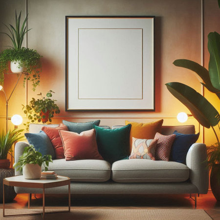
Pillows, throws, and area rugs are the unsung heroes of color layering. Opt for fabrics that echo the primary tones of your palette, but don’t shy away from incorporating subtle variations or patterns. For example, if your scheme is based around cool blues and soft grays, introduce a few accent pillows in deeper navy or muted teal for depth. A textured rug that weaves together several colors can ground the room and tie disparate elements together.
Artwork: Visual Anchors
Art has the power to both reinforce and gently challenge your color story. Choose pieces where at least one or two colors reflect your existing palette—this creates a visual thread throughout the room. Abstract prints with hints of your accent shade or classic photography in sepia tones can provide sophistication without overwhelming the senses. In American homes, gallery walls are popular; just ensure there’s a balance between cohesion and variety by uniting frames or matting in similar finishes.
Décor Pieces: Personality with Purpose
Sculptural objects, vases, books, and candles are more than finishing touches—they’re an opportunity to add character and interest. Select items in complementary shades to avoid clashing or visual noise. For instance, if brass is part of your palette’s metallic accents, incorporate it through lamp bases or decorative trays. Layering wood tones is another way to introduce warmth without straying from your core colors.
Maintain Harmony with Intentional Choices
The key to successful accessorizing is restraint and repetition: repeat certain colors or textures throughout the space so each element feels intentional rather than accidental. This not only maintains a sense of harmony but also allows your personal style to shine through. By thoughtfully curating every layer—from cozy textiles to statement art—you create a living room that feels cohesive, inviting, and distinctly stylish.