Introduction to Color Psychology
Color psychology is the study of how colors impact human emotions, behaviors, and perceptions. In home design, especially within American living rooms, understanding color psychology is essential for creating spaces that feel welcoming, comfortable, and tailored to both family life and entertaining guests. Americans often use their living rooms as multifunctional hubs: a place to relax after a long day, gather with loved ones, or host friends during holidays and special occasions. The colors you choose for your living room can subtly influence the mood, energy, and even the perceived size of the space.
Color choices are more than just personal preferences—they reflect cultural trends, lifestyle needs, and even regional tastes. For example, while soft neutrals may evoke calmness and sophistication in suburban homes across the U.S., bold accents might energize urban apartments. By understanding basic color psychology principles, homeowners can select palettes that support their desired atmosphere—whether that means fostering tranquility for family movie nights or encouraging lively conversation during get-togethers.
Heres a quick overview of how common colors are interpreted in American home environments:
| Color | Common Associations | Living Room Impact |
|---|---|---|
| Blue | Calmness, Serenity, Trust | Makes the space soothing and inviting |
| Yellow | Happiness, Warmth, Optimism | Adds cheerfulness and energy |
| Green | Balance, Freshness, Renewal | Brings harmony and nature-inspired vibes |
| Gray | Sophistication, Neutrality, Modernity | Creates a versatile and elegant backdrop |
| Red | Passion, Excitement, Boldness | Adds drama and stimulates conversation (best used as an accent) |
| Beige/Taupe | Warmth, Comfort, Simplicity | Makes the room cozy and timeless |
As you plan your living room makeover or refresh, keep in mind how these color associations can help you achieve your ideal environment for both daily living and hosting memorable gatherings.
2. Understanding the Function of the Living Room
In American homes, the living room holds a central place not only in the physical layout but also in daily life. It serves as a versatile hub where family members come together to relax, share stories, and create lasting memories. Simultaneously, this space acts as the primary area for entertaining guests—hosting everything from casual get-togethers to holiday celebrations. Because of its dual purpose, the living room’s atmosphere must balance comfort and hospitality. The design choices here—including color—directly influence how welcoming and functional the space feels for both intimate family moments and lively social gatherings.
| Living Room Functions | Key Activities |
|---|---|
| Family Bonding | Movie nights, game sessions, conversations, relaxation |
| Entertaining Guests | Dinner parties, celebrations, hosting friends and relatives |
This multifunctional aspect means that color psychology plays a crucial role in setting the right mood. Warm tones may foster a cozy environment ideal for families, while cool or neutral shades can convey sophistication and put guests at ease. Striking the right balance ensures your living room is both an inviting retreat for loved ones and a welcoming venue for visitors.
3. Popular Color Choices and Their Meanings
When it comes to designing a living room that feels welcoming and comfortable for both family and guests, color selection plays a crucial role. Different shades evoke unique emotional responses and set the tone for social gatherings or quiet evenings at home. Below, we break down some of the most popular living room colors in American homes and explore the moods they help create.
| Color | Atmosphere Created | Cultural Associations |
|---|---|---|
| Blue | Calm, serene, trustworthy | Often linked with peace and relaxation; ideal for creating a soothing environment where guests feel at ease. |
| Beige | Warm, inviting, neutral | A classic choice in American interiors; communicates comfort and versatility, making it easy to match with various décor styles. |
| Gray | Sophisticated, modern, balanced | Popular in contemporary design; conveys stability and a sense of understated elegance without overpowering other elements in the room. |
| Green | Fresh, revitalizing, harmonious | Symbolizes growth and renewal; brings a touch of nature indoors and promotes relaxation and balance. |
Blue: The Calming Classic
Blue remains a top choice for living rooms because it naturally encourages calmness and trust. Lighter blues can make spaces feel airy and open, while deeper navy tones add depth and sophistication. Blue is especially effective in family-centric spaces where relaxation is key.
Beige: The Welcoming Neutral
Beige serves as a warm backdrop that complements both traditional and modern furnishings. Its neutrality means it doesn’t compete with other colors or décor items, providing a cozy and flexible foundation for any style. Many American families choose beige for its timeless appeal and ability to make everyone feel at home.
Gray: The Modern Favorite
The popularity of gray has surged in recent years due to its chic yet subtle vibe. Gray can be paired easily with bold accent colors or kept monochromatic for a minimalist look. It’s an excellent option for those seeking a polished, contemporary atmosphere that still feels inviting.
Green: The Invigorating Touch
If you want your living room to feel alive and connected to nature, green is an excellent pick. Sage or olive greens are especially trendy in U.S. homes, offering both energy and tranquility—ideal for lively family gatherings as well as peaceful downtime.
4. Blending Individual Preferences with Universal Appeal
Finding the perfect balance between your personal color preferences and what makes guests feel comfortable can seem challenging, but it’s absolutely achievable. The key is to select hues that reflect your unique style while also creating an inviting environment for everyone who enters your living room. Here are some practical strategies to help you get started:
Consider Your Signature Style
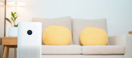
Start by identifying colors you naturally gravitate toward. Whether you prefer calming blues, energetic yellows, or rich earth tones, let your personality shine through in accent pieces like throw pillows, artwork, or rugs. These elements allow you to showcase your taste without overwhelming the space.
Balance Bold Choices with Neutrals
If you love bold colors, pair them with neutral shades—think white, beige, gray, or taupe—for walls or larger furniture pieces. This approach grounds the room and ensures it remains approachable for guests. For example, a navy accent wall can be softened by cream-colored sofas and light wood finishes.
Selecting Welcoming Colors
Certain hues are universally recognized for their welcoming qualities. Warm tones such as soft yellows, gentle oranges, and muted reds promote sociability and comfort. Cool tones like sage green or sky blue evoke calmness and relaxation. Consider combining these guest-friendly shades with your favorites for a harmonious look.
Color Selection Strategies Table
| Strategy | Personalization | Guest Comfort |
|---|---|---|
| Accent Colors | Choose accents in your favorite colors (pillows, art) | Keep main surfaces neutral for broader appeal |
| Layered Tones | Add depth with varying shades of one color family | Avoid high-contrast palettes that may overwhelm guests |
| Natural Elements | Incorporate wood, stone, or plants in preferred tones | Create a soothing, organic atmosphere |
The Importance of Lighting
Remember that lighting dramatically affects how colors appear in your living room. Test paint samples at different times of day to see how natural and artificial light interact with your chosen palette. This helps ensure both your style and the overall mood are preserved no matter when guests visit.
Pro Tip: Flexible Accessories
Switching out accessories seasonally or for special occasions is an easy way to refresh the space and keep it feeling welcoming year-round—without committing to a major redesign.
5. Practical Tips for Implementing Color in Your Living Room
Transforming your living room with color doesnt require a complete overhaul or huge budget. By strategically introducing hues through paint, furniture, textiles, and accent pieces, you can easily set the mood for family gatherings and entertaining guests. Here are actionable tips to help you incorporate color effectively:
Start with Paint
The walls are often the largest canvas in your living room. Decide whether you want a bold statement wall or a subtle backdrop. If youre unsure, consider neutral tones as a base and add pops of color elsewhere. Remember, lighter shades can make a space feel larger and more open, while darker colors create coziness and intimacy.
Choose the Right Furniture
Furniture is an excellent way to introduce color without overwhelming the space. Opt for a vibrant sofa or colorful armchairs if you love making a statement, or choose neutral furniture accented with colorful throw pillows and blankets for flexibility.
| Element | Color Suggestions | Mood Impact |
|---|---|---|
| Sofa | Navy Blue, Soft Gray, Forest Green | Calm, Elegant, Sophisticated |
| Accent Chair | Mustard Yellow, Coral, Teal | Energetic, Inviting, Playful |
| Coffee Table/Rug | Natural Wood, Patterned Beige/Blue Rug | Grounding, Harmonious |
Add Color Through Textiles
Pillows, throws, curtains, and rugs are easy to swap out when you want to update your look. Layer textures and patterns to add dimension and interest. Don’t be afraid to mix warm and cool tones—just keep a cohesive palette for balance.
Tips for Mixing Textiles:
- Pillows: Combine solids with subtle patterns.
- Curtains: Choose colors that complement wall or sofa colors.
- Rugs: Anchor the space with area rugs featuring key accent colors.
Select Accent Pieces Wisely
Lamps, vases, picture frames, and artwork offer opportunities for bursts of color that can be updated seasonally or as trends change. Metallics like gold or brass add warmth and sophistication while colored glass or ceramics create playful focal points.
Pro Tip: Use the 60-30-10 Rule
This classic interior design rule helps maintain balance: 60% dominant color (walls), 30% secondary color (upholstery), and 10% accent color (accessories).
By thoughtfully layering color through these elements, you’ll craft a living room that feels both welcoming and uniquely yours—a perfect setting for both family relaxation and lively gatherings with friends.
6. Lighting and Its Impact on Color Perception
Lighting is a crucial element in how colors are perceived and experienced in your living room, dramatically influencing the mood you create for family and guests. The type of lighting—natural or artificial—not only affects the appearance of wall colors, furniture, and decor, but also shapes the overall atmosphere. For example, a soft white light can make warm tones cozier, while cool daylight might make the same shades appear more vibrant or even stark. Understanding how different lighting environments interact with color psychology can help you design a living room that feels inviting and comfortable at any time of day.
| Lighting Type | Effect on Color Appearance | Mood Created |
|---|---|---|
| Natural Daylight | Shows colors in their most authentic form; changes throughout the day from cool (morning) to warm (evening) | Dynamic, fresh, energizing during the day; cozy and calming in the evening |
| Warm Artificial Light (Incandescent/LED 2700K-3000K) | Enhances reds, oranges, and yellows; can mute blues and greens | Inviting, intimate, relaxed—perfect for family gatherings |
| Cool Artificial Light (LED 4000K-5000K) | Makes blues and greens pop; can make warmer colors look washed out or harsher | Modern, bright, alert—great for social events or reading areas |
To achieve the perfect mood in your living room, consider layering different light sources—overhead fixtures for general illumination, floor lamps for ambiance, and task lights for specific activities. Dimmable bulbs offer flexibility so you can adjust brightness to suit any occasion. Remember, testing paint samples under both daylight and your preferred evening lighting will ensure your chosen palette works harmoniously around the clock.
Final Thoughts: Creating a Balanced Space
As we wrap up our exploration of color psychology in the living room, it’s essential to remember that the right color choices can make your space both welcoming and harmonious for family and guests. Here’s a quick summary of the key points to keep in mind when designing your living room with color psychology:
| Color Family | Mood Created | Best For |
|---|---|---|
| Neutrals (Beige, Gray, White) | Calm, Spacious, Timeless | Creating a versatile backdrop; easy to accessorize |
| Blues & Greens | Relaxing, Refreshing, Soothing | Promoting conversation and comfort; ideal for family rooms |
| Warm Tones (Yellow, Orange, Red) | Energetic, Welcoming, Cozy | Lively gatherings; adding warmth and vibrancy |
| Darker Hues (Navy, Charcoal) | Sophisticated, Intimate | Creating cozy nooks or dramatic focal points |
Tips for Achieving Balance
- Mix and match colors thoughtfully—combine calming shades with vibrant accents for interest.
- Use decor elements like throw pillows, rugs, and artwork to introduce pops of color without overwhelming the space.
- Consider natural light; brighter rooms can handle bolder colors, while dimmer spaces benefit from lighter hues.
Personal Touch Matters
Your living room should reflect your personality as well as serve the needs of everyone using it. Don’t be afraid to experiment with different color combinations until you find what feels just right for your home.
The Takeaway
By understanding color psychology and applying these principles intentionally, you can create a living room that’s both inviting for guests and comfortable for daily family life. Remember: balance is key—let your creativity shine while keeping harmony at the heart of your design choices.